Thursday, July 29, 2010

To Have and To Lose

A sweet summers sun warmed their happy hearts when their love blossomed to the heavens.

A site to behold when their vows were told in a field of Earth's gift to us.

A day of joyous tears when their little one joined their world.

A wonderous future laid out before the bright family of three.

Then one dark day, the midday train came rolling into the station.

Upon that train was an unwelcome visitor that no one ever wishes to meet.

An empty crib with the ghostly whispers of the child's laughter lingering.

A constant reminder that the unwelcome visitor stole what was most precious in the world.

With nothing to live for depression gained ground to lay heavy in their hearts.

Forever to live with the lose of love and the memory of what once was there.

Journal 19

The myth that this advertisement plays towards is that a person can lose weight and achieve a flat stomach by anything other than a healthy diet and a exercise plan. America has a horrible habit of believing that good things like healthy bodies, money, or happiness can be gained in an instant and the advertisement is telling the audience that by rubbing this 3-step cream on their bellies and following the Bremenn Toning Program will cause them to instantly have a flat tummy. The truth is you're really paying $120 just to rub lotion on your stomach and follow a diet/exercise plan that you can create with doing free research on the internet. the denotative portion of this advertisement is the woman's flat stomach with a tiny bikini bottom. And the connotation of the woman's flat stomach and small bikini is the idea of sexiness radiating from the woman's body. If products like this actually worked then the advertisement might work except for the fact that they is too much wording that the reader might just skip over the ad all together. But for those of us who are intelligent consumers understand that having a "sexy" body takes a lot of time, discipline, and dedication.

Journal 18

For this assignment we were to find n advertisement that follows Frank Jefkin's three basic principles of effective advertisement writing. The three principles in short are to be of interest and value to the reader, be precise and to the point, and lastly be concise, say what is needed to be said in as little words as possible. The advertisement I found was for Crystal Light Pure Fitness water flavorings. The coloring and imagings are simple with the boxes of the product as the center focus. But as far as the wording, the top introduction wording says, "Crystal Light is making a splash." easily understanding the company the advertisement is for and that it is selling a new product. Then it shows the product and underneath the image is the bulk of the written portion saying,

Water Your Body
Want a delicious way to get more water into your day?
Try new Pure Fitness Crystal Light
No artificial sweeteners
No artificial flavors
No preservatives
Low calorie
Plus electrolytes

Simple fragmented sentences list what is different about Crystal Lights new drink that would cause their target audience, health conscious, fitness oriented people looking for a healthier drink option over Gatorade and Powerade. The reader isn't overpowered by wording and quickly understands what is being sold to them.

Journal 17

Sweet 'N Low used their signature color of pink in their entire advertisement. Shades of pink used in the ad reminds one of youth, innocence, and, to the Western World, sweet little girls; key word sweet. The color harmony is both analogous and monochromatic. As of analogous you see shades of pink/red, purple, and yellow/orange. On the color wheel purple, red, then orange are the sequence of colors and analogous is described as three sequencing colors used to create a harmony. Why I believe it is also monochromatic is because the image mainly consists of values of red which includes pinks. /the use of the image of the owl can not be understood so easily but the use of color, which closely relates to the product, helps the advertisement in its success.

The main focus color for the Real Fruit Smoothies by McDonalds advertisement is white. Many people associate white as being a clean, pure color which correlates to the product being sold by promoting a fresh, enriching taste of the smoothie. As far as the smoothies being pure stands to mean the flavoring of the smoothies they use are real fruit instead of artificial flavors from powders. Pink brings out the idea of youth and vitality which is what the consmer is hoping to feel after drinking one of the smoothies. The colors used in the advertisement greatly helped to promote the new "Real Fruit Smoothies" by McDonalds.

Tuesday, July 27, 2010

Journal 16

Pandora's logo uses a blue and white color scheme which could be described as a monochromatic color scheme because it uses blue, light blue, and white. I think the meaning they were trying to go for by using blue was the fact that it is a calming color and when you get to listen to the music you like without paying for it with hardly any commercials then you become calm as well.

The Arizona Diamondback colors use red, or Sedona red as they go by, as the dominant color and black and white as the accent colors. I would suppose that this is also a monochromatic color scheme as well because the different values of red can lead you to both white and black. Using words from the PowerPoints, they used red to symbolize passion and excitement and hopeful cause the view to feel enthusiasm for the team.
Firefox uses blue, orange, and yellow for their color scheme which works as a split complimentary color harmony. The blue may symbolize for knowledge this time due to it being the color of the world, orange for energy to stand for the quickness Firefox offers, and lastly yellow would work as optimism for if you use Firefox you'll find exactly what you need.

Thursday, July 22, 2010

Journal 12, 13, and 14

The first advertisement found was for State Farm Insurance in the Family Circle magazine. The photo is of a new, very handsome father holding his young child. The text over the picture says "You know where DUDE meets DAD? I'm there. Whoa, that happened fast, didn't it? The next 18 years will zip by, too. So don't wait until Junior becomes a Senior to figure out how much life insurance is enough to protect your new family. Let State Farm help. Call, click, or visit a State Farm agent today, because Like a good neighbor, State Farm is there." The feeling one gets from viewing the picture is of looking forward into the future, planning for the protection of one's family, devotion. The myth of fathers as protectors of the family plays a role here proven just by the wording and use of the father/son image. Obviously targets young fathers as the main audience and the choice of the magazine as Family Circle was a great idea because the magazine has viewers that are family oriented people. The character function as a sign of compassion or fatherly love by the way the father. The fear of leaving your family with no money is what the advertisement is trying to provoke and by buying life insurance from State Farm you'll achieve peace of mind, along with having people who care looking out for you based on "... like a good neighbor, State Farm is there."

Microsoft and Bungie have put together an amazing game series called Halo and in the magazine Game Informer I found this advertisement for Halo Reach. The image shows characters from the game walking over a hill with a planet on fire behind them. One who understands the background of the game understands the story and will get the feeling of pride and hope from the image. I suppose the only myth one can gather from this image is the idea that people who've played the game will know what's going on. The whole gamer-nerd idea, which I like to believe I am. The target audience and the myth a completely entwined with each other. Those who play the game and love the game are the audience, besides the fact that the game they are advertising is a prequel so there may be places in the game that those who haven't played the other games wouldn't understand. What a consumer can gain form purchasing this game is answers. Answers as to how the characters in the game before came to be and just better understanding of the full story. The story will be complete.


This last advertisement is for The Goodlife Recipe pet food from the magazine People. The image shows three cats and four dogs, each with a thought bubble next to each of them with a food item inside. The wording on the image says "It's what they think about. So it's all we think about." The company is playing with the myth that animals have no preference with what they eat and ever true pet owner knows that a pet has particular food they like and don't like. The myth is abolished by showing the animals thinking of food like chicken, fish, and carrots (apparently, that dog likes carrots). By buying the pet food The Goodlife Recipe the owner will be satisfying their pets and making them happy. Also, it will make their pets healthier because the small script says that their pet food is "...made with real, wholesome ingredients with no artificial flavors or fillers."

Wednesday, July 21, 2010

Journal 11

Assignment 11 was for us to create signs of decisions we have to make during the day.

1. Music or Not
Personally, there is no decision to made here but there are the awkward few (teehee) who prefer silence. One of the decision when one gets into their vehicle can be whether to turn the music on or keep it on.

2. Soda vs. Water
Some people, like myself, are trying to be more health conscious yet have an extreme addiction to sugar. Anywhere you go or even at home you usually have soda and water as your big drink decision (not hating on tea because I love tea. Just soda and water came to mind best.).

3. Chicken or Beef
At many restaurants and fast food places, you have the option for either chicken or beef to different food items. Thinking more so with mexican food, you have the option for chicken or beef tacos, chicken chimichanga versus shredded beef chimichanga, etc.

4. No sunglasses vs. Sunglasses
When you have one of those partly cloudy days and your unsure of if you need to wear your sunglasses or not, that is where this decision making applies.

5. Skirt or Shorts
When it comes to going out to the movies I can spend around 30 minutes trying to decide on what to wear. Whether I want to look cute and wear a skirt/dress or would I rather just be comfy and wear shorts. Almost always, I choose comfort.

Thursday, July 15, 2010

Journal 10

Metaphors in Advertisements
Our assignment today was to find an advertisement that uses metaphors and the one that I found is about a pain relief cream. It shows a woman in a fixed pose that only strong gymnasts can do while holding a marionette cross bars with strings attached to her clothes. Underneath is a picture of the cream and the saying "Take Control Again". It plays with the idea of the puppet and puppeteer with pain being their puppeteer with your body. When you use their pain-relief cream you no longer are restricted from doing the thing you want to do when pain was holding you back. In a sense, as far as what the advertisement is trying to say, when you take their cream you become the puppeteer of your own body again. I believe this advertisement is successful in getting the point across due to the fact that most everyone understands the roles of puppets and puppet masters. The lighting and colors used within the advertisement place a calm and content mood within the photograph and the women does not seem to be struggling with her pose. Though the image of the product is small and placed at the bottom of the picture, the womens body draws the viewer's eye down to the bottom where they see the product and then under it the saying. Beside the image having great balance and color choice, the message easily gets across to the audience and therefore the advertisement is a success.


Wednesday, July 14, 2010

Journal 9

Assignment 9 asked us to take 10 photos of objects we believed were great inventions and then 10 photos of objects that we couldn't live without.

Greatest Inventions
From top to bottom, left to right, my first image that I believe is a great invention is the gas stove. To be able to control fire with the turn of a knob was a great idea and helped to make cooking easier for even the most inexperienced cook. Second image is of a piano. Music is one of the greatest thing to ever come out of humanity and one of my favorite instruments is the piano. Amazing pieces have been composed on the piano and some of the most famous composers began as pianists. The telephone was another invention that was important in shaping our modern world. Communication went from snail mail by horseback, to Morse code, and then to the telephone. And the telephone/cell phone is one type of technology is continually changing and creators are always finding ways to make it better than the last. The microwave made for easy cooking for a kid. Of course that means top roman, easy-mac, simple cheese crisps, etc. Washers and dryers helped to give people more time to spend so that instead of spending hours at a wash board, scrubbing laundry, people could just leave their clothes in a machine that would clean their clothes for them. The clock was invented thousands of years ago. A way for humans to control their days better by understanding how to use their time wisely. Medicine has helped to extend the life expectancy of human to where one can have a knee to a heart valve replaced. Also, ibuprofen is great for when your knee aches whenever you walk because you decided it would be a great idea to tear your ACL twice. Microwavable popcorn has brought families and friends together on those Family Friday Movie Nights. The outlet is there to represent electricity. Without electricity, I could not power up my favorite objects. And lastly, the vacuum which also saves time with cleaning carpets.


Objects I Can't Live Without
Anyone born and raised in Phoenix summer heat understands that it would be extremely hard to live without AC. I love my camera because I am able to capture great moments and memories in pictures. I have a need to keep connected with those I love so therefore I have my cell phone as something I couldn't live without. A laptop is of extreme importance to me because it is my life, my entertainment, it holds my music and my memories. Everything is on my computer. Lotion. Again with living in the dry Arizona heat, lotion is need to keep those legs looking great in shorts. My mp3 player is constantly on. I wake up and turn it on, drive with it (playing out of my car speakers might I add), walking to class, reading, and even to help me fall asleep. Music completes me. My hair straightener makes my hair look beautiful. Television for my great time passer. My car Lil' Red gets me wherever I need to go, thanks for the hand-me-down Dad. And the ultimate entertainment for me is my XBox 360! Just something I can no longer live without now that I own one.

Journal 8

Emotional Images
In this project we were instructed to find images that represented 5 different emotions; angry, sad, joyous, uninspired, and scared. For angry, I thought of what I do when I'm truly angry and the one thing I thought of was I make fists. I'm one of those angry people that feel like hitting something (but when I can't I cry instead. HAHA. Lame). So I found an image of a fist and the one I found fit my idea of angry for it shows the muscle tension within the hand and looks as if someone is holding in their frustration by making a fist. For sad, the empty, foggy playground is what I found to represent the emotion. An empty playground is sad to me because I think of the lack of laughter and joviality when you think of children at play. Also, the way the fog and wetness saturates the colors of playground and one's mood. When thinking about being joyous I think of bright colors and flying, being free. With hot air balloons, you have that freedom of the sky and the bright sun. Also the rainbow of colors used to create different designs on the balloons are fantastic. So based off of opinion, I chose the picture of sand dunes as my representation of uninspired. When I think of a place like the Sahara desert I see a wide expanse of nothingness. A place were you can easily get lost and have no idea where to start your long trek through the hot desert under a beating sun. Lastly, I found the image of a dark room with a single TV showing white-noise as my image of scared. I'm not sure it truly expresses the emotion but sure causes me to be scared. Like many movies, TVs can often be a part of the scares, like when the girl crawls out of the TV, a person will turn to look at a TV and see a shadow behind them, and there was even a movie called White Noise.

Journal 7

Vegetarianism creates peace within the body, mind, and soul!

Journal 6

Ransom note to Mr. PB

Sunday, July 11, 2010

Journal 5

Men and Womens Restroom Signs
I chose the classic male and female symbols to represent the different genders for the restrooms. The white shows up well on the blue and even better if the bathroom door is in a hallway that's dark. The symbols are meant to stand for the reproductive organs therefore most in the world are able to connect with the symbols to understand which room to use.

Fire Extinguisher
The colors chosen for this sign are that associated with fire. The figure holding the fire extinguisher pops off the yellow making it more noticeable when seen from across a room. I created this sign at my work and when I asked any of the children from camp what they thought the sign was for and each instantly understood it was for a fire extinguisher. Whether its a child or someone that does not even speak English, they could easily understand what the sign stood for.

Janitor's Closet
A broom and dust pan were chosen for the symbols on the Janitor Closet sign. Brooms and dust pans are associated with cleaning for that is their uses. So I thought that if someone found this sign on a door, they'd understand it would be for those who clean or storage for cleaning objects. Since I used black for the objects, I chose to make the objects more as outlines instead of entirely solid symbols that way they stood out better and viewers can decipher what they objects are.

Executive Washroom
Yellow was my choice for this restroom sign because one can connect yellow to be similar to the color gold which relates to crown. Since there is a need for an "executive washroom" then the person the bathroom is meant for obviously believes they are better than their employees. An attitude that goes with royalty. That being the case, I decided to put a crown over the image of a toilet for new sign for the Executive Washroom.

Parking Garage
I used the idea of viewing three-level car garage from the side when I created this sign. I took the colors from many road signs you see everyday that instruct you on where to go. White and black are very simple and I believed that they worked here along with the symmetry of the images.
Exit
A simple sign to understand which is that of a figure walking out of a door. The viewer will understand that it is an exit because the arrow is pointing towards the open door, not away. Red was the main color choice due to the fact that it's an attention grabbing color which in emergency cases, the exit would need to be found right away.

Friday, July 9, 2010

Journal 4


Curious how the arrow can be found just about anywhere in our world yet most don't see the importance of the arrow above all other symbols in our world. As Phil Patton described in his article "Setting Sights on the Arrow", the arrow must predate civilization back to when humans were still living in caves and hunting with sticks and rocks. He suggested that possibly a long ago ancestor had drawn an arrow to a cave or where fellow humans could find good prey to hunt. The arrows that I found are more simple than that of what Patton was talking about. Some shared the same point of direction but most were just arrows and things that made the shape of an arrow that I found at my work at the youth summer camp.

From the top, moving left to right, I start with the picture of the clock. The toy clock is a learning tool for the kids at camp to help them learn how to tell time. The use of the arrows I believe are to help the children to distinguish what the hands are pointing at better than what the straight lines that can be found on most analogue clocks.
The second image is that of an educational diagram of the importance of fire alarms and how to make sure they work. The picture shows a person's hand pushing in a button on the alarm and with the wording "monthly test" and the arrow pointing from the words to the button being pushed, someone looking at this diagram can understand that to perform the monthly test is by pushing that button.
Photo number three is that of the standard computer pointer. The arrow is simple and does the necessary job of pointing to objects on the screen that the user is trying to select. A question formed in my head after beginning this study, why the arrow? Why did the makers of user interface programs choose the arrow to help the user select items? Thinking about it, they could have simply used a dot or some other shape but, understandably, the arrow "points" and you point at the object you want to select.
The next photograph is from the game Pictureka!. The point of this arrow is just for space filler and, of course, for when you draw the card telling you to find 10 arrows in the alloted time.
Number five is that of a "Transformer" that a lot of boys at the camp make using the toys called Zoobs. The part shown in the picture is the long tail one boy had made where the end looked like an arrow to myself and to some of the kids who were helping me. Even in just creation, the child chose to make the tail into an arrow. Whether it was consciously or subconsciously, I find it interesting.
Picture number six is another photo of a diagram where it is showing the view to cycle of a butterflies life. I've noticed that many "cycle" diagrams are made this way, one of which easily comes to mind is the cycle of water and how it goes from cloud, to rain, to ground water, to evaporation, and back to clouds.
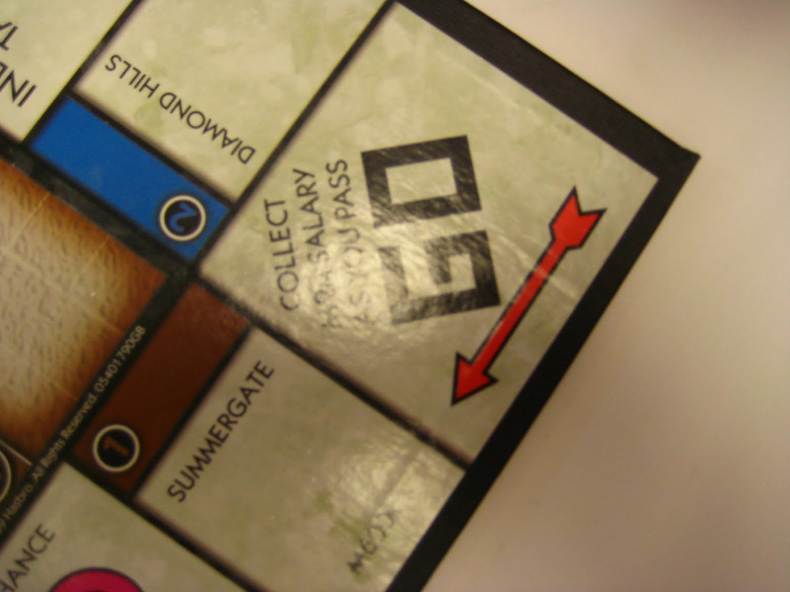
Image number seven is from the well known game Monopoly where this is showing the direction the player goes after they have done a complete rotation around the board.
Another directional arrow, this arrow I found on a globe where it's telling the viewer which direction the Earth rotates. The globe was full of arrows such as showing the different directions of water flow in the oceans and even simple showing what small county the name belonged to that couldn't fit within it's boundaries.
Next, number nine is the recycle sign on a Dasani water bottle. I believe that the way they changed the symbol by using a leaf as the point of the arrow was successful in connecting it to the "green movement" that has been going on with many companies in the U.S. It connects the idea of recycling to the environment and may hit home with the consumer more so than just simply using the standard recycling arrows.
The job of the arrows in image number ten is to draw attention to the reader. The poster was made by the Luke Air Force Base Library advertising a free homework help program.
Picture number eleven is of one of my adorable little girls in the program trying to help me with my homework. Thinking on her feet, she thought that if she lifted the arms of this stuffed monster over its head it would create an arrow.
The classic carpet city that you find at any play room for kids. This, like arrows found on any city streets, is directional.
Next, I took a picture of a picture. The picture was of an obstacle course the kids were setting up and I see the arrow with the point made by the space between the kid's legs and the line of toys is the line of the arrow.
In the dance studio, I found this poster of a ballerina stretching. The arrow point is made at the waist and follows down the woman's back and her legs make the line of the arrow.
Found on every fire alarm is the arrow that directs people which way to pull the lever to set off the alarm.
The arrows on image sixteen are on a poster for the Keystone club. The arrows are pointing from the words "Keystone" and branches out to the different points the poster is saying the club promotes, such as "academic success".
Picture seventeen is of instructions on how to move the cart that the sticker is on. It shows a person pushing the cart and the directional arrow proves the person is pushing not pulling.
Number eighteen is of a symbol on a Luke AFB poster. I don't quite remember what the poster was about but I believe the symbol was created to represent the base in some way.
Nineteen was found on our fire evacuation map. The arrows point the path that the people in the room that that particular map is posted are supposed to leave the building to get to the designated meeting place for everyone in the building. The arrows in red are the primary routes and the arrows in black (show in the photo) are the secondary routes.
Finally image twenty was found on a large pad of paper where kids were playing pictionary. The use of the arrow here was most likely to draw attention to a certain object that the drawer wanted the guessers to focus on, the arrow is directing the viewer's eye.